A dramatic theme of a ‘mansion‘ submerged under water
Designed to be a romantic restaurant for couples, the atmosphere is light, cool, elegant, beautiful, watery, and soft. Wavy banquettes and curved elements such as the pendant light central feature pick up on the curves in the architecture.
The centre of the room has the focal point of the space – a long white table, almost like a grand table in a home decorated with vases filled with fabric orange flowers. Pieces of white coral also decorate the tables.


The dining chairs are by Capdell. The flooring is by aparici. The floor tiles are a mix of blue and white, white a textured beachy effect in a chevron format. Fabrics are developed by FIG with our joinery partner in DR, Invisa who produced all of the joinery for the restaurants.
We were so lucky to have the huge ceiling height here, we painted the ceiling white unlike all the other restaurants in the Village Centre, allowing this restaurant to really stand out for the couples. We specified the huge lighting chandeliers who were produced by a supplier in Spain.
A romantic dining experience with a cool, fresh & light backdrop

Sweeping views of the beach & tropical landscaping
This restaurant has the best view of the main beach and swimming pools than all of the other restaurants. We deliberately designed the interior with this in mind. The central table and lighting features are elegant but do not block the view. Guests can be delighted by the views upon entering the restaurant. The blue columns frame the view perfectly. There is also an outdoor terrace with all outdoor furniture by one of our favourite suppliers called Vondom. From this terrace guests also have a fantastic view of the main bar, enjoying a space free from the families area.

Bespoke luxury joinery details & furniture design
FIG usually design restaurant furniture ourselves alongside our production partners. The banquettes in this restaurant were designed as curved waves to tie in with the underwater theme. They were produced in a factory in Santiago in the north of the Dominican Republic owned by a company called Invisa. Invisa specialise in joinery and produced high quality work for all of our F&B outlets in this resort. We also developed our own fabrics with Invisa. FIG designed the tables which were produced in Spain with Andreu World. The table tops are a high quality marble laminate and the bases are a gold tinted metallic finish. The gold tints combined with marble effect, the quality chairs and light fixtures all create a luxurious ambience.

More creative projects


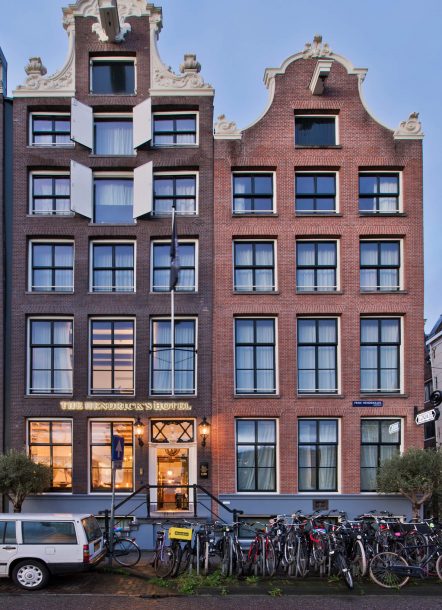
A blend of Victorian & Dutch inspiration
Our starting point for the branding was the silhouette of the building. We used this silhouette as the main logo then a Victorian typeface through the middle of the image.
We designed the logo and then implemented the brand through to the external signage, wayfinding and room numbers. Against the gold wallpaper in the corridors we fixed enamel plated signs and on each door we printed a different woman a name to continue the theme of the mischievous Prince!


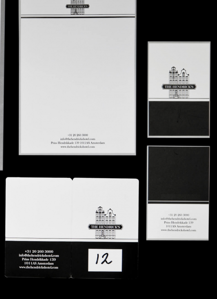
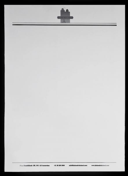
Stunning black & white stationary
The stationary was designed around the black and white theme, the two buildings logo features on the cards, compliment slips and the envelopes. The serif font we used gave the set a traditional feel harmonising with the interior design.

Traditional & Quirky naming
The story behind the name of the hotel was generated by our team. We loved that the hotel was on the famous street called ‘Prins Hendrikkade’, a long road that passes by central station. We researched into the Prince and discovered his adventurous past. We wanted to build a story around him and his past so that guests would feel as though they were stepping into his world. So this is why we chose to name the hotel after him!
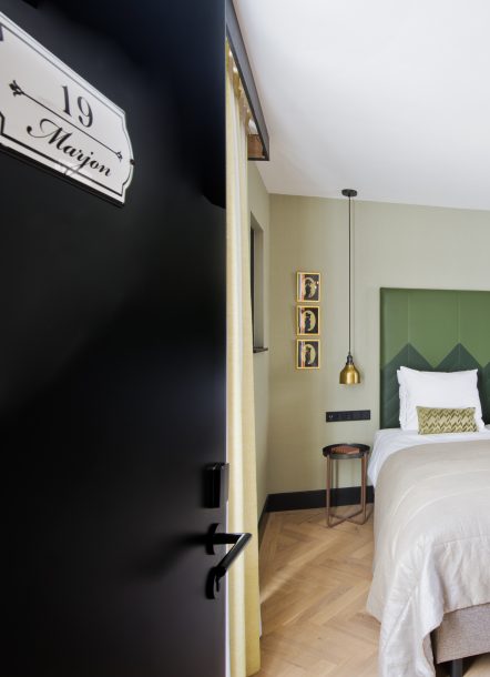
A Dutch woman’s name on every door
As the Prince loved women so much we came up with the idea of naming the rooms after fictitious women – whether from upperclass society or women’s names that used to be lower class names. We believed that the Prince loved women from every walk of life and was non-discrimatory! We find it fun to hear stories of guests asking why their room was named ‘Dorothya’ or ‘Marion’! There is a narrative behind the branding too which we love to create alongside the interior narrative.

A warm & inviting welcome
The exteriors of our projects are just as dear to us as the interiors, especially when it comes to signage. The plaque on the right side of the main door was a lovely touch to add to that feeling of arriving at an important establishment, with history. We framed the entrance door with typically Dutch lighting replicas of the original lights, and on the left building we backlit the full hotel name in a warm light, nestled between the front street height windows and the windowsills of the first floor.